![UrbanSDK_primary_logo_horizontal_white.png]](https://urbansdk-9267502.hs-sites.com/hs-fs/hubfs/UrbanSDK_primary_logo_horizontal_white.png?height=40&name=UrbanSDK_primary_logo_horizontal_white.png)
Review Metric Health
Edit Speed Limit
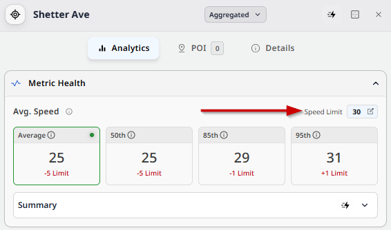
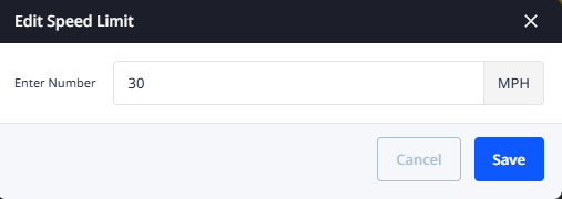
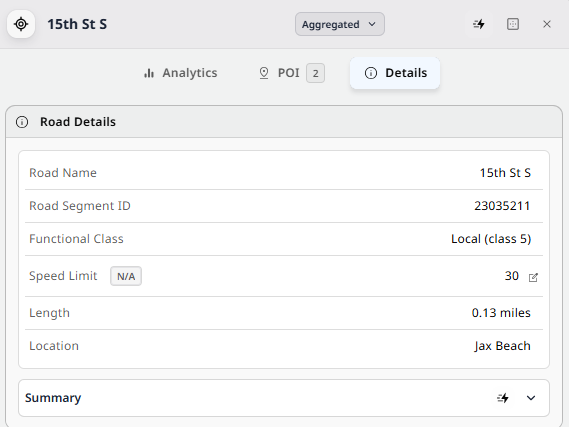
When a road segment is selected, the Analytics panel opens, displaying different scorecards, data, and other information about the selection. The Speed Limit for the selected area can be edited/updated as needed using the edit functionality. When a user clicks the edit button, an “Edit Speed Limit” dialog box appears where users can enter a new speed limit.
Screenshots: Edit Speed Limit UI
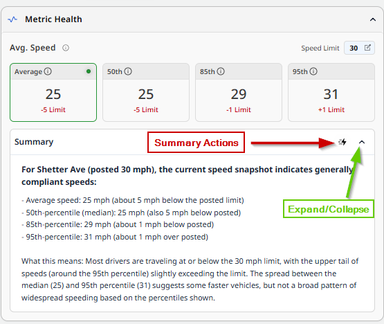
(AI) - View Summary under the Scorecard
Within the scorecard for a specific section of the Analytics panel, a couple options exist for the AI Summary. The AI-generated text can be copied to a user’s clipboard for use in other software applications. The summary area can be collapsed/expanded as needed, and the Quick Action button displays, when clicked, the following:
- Copy the summary to the clipboard
- Add the current trend view as a page in the Report Builder
- Export the data as a CSV file.
- Export the visible analytics section as a PNG.
Review Trends
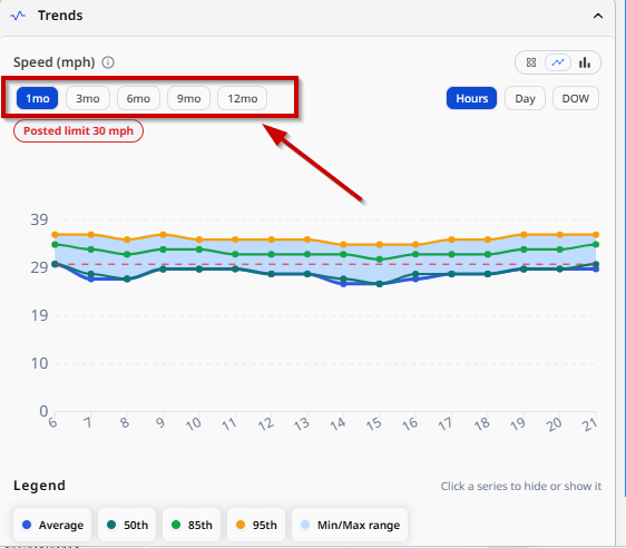
Set Trailing Period
To view the change in trends over a period of time, users can set a trailing period that allows them to see the trend over a period of time. To set this, simply click the time measurement (hours, day, month) and select the interval (e.g. 1 month, 3 months, 6 months, etc.).
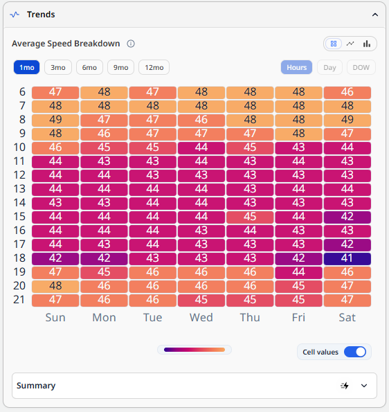
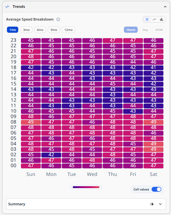
Heatmap
The heatmap allows users to view a breakdown of speeds across a time period. Similar to the bar and line graphs, this is a visual representation of the average speeds at the time of day and day of week. In addition to the color identifying the speed in relation to the speed limit, users can also toggle numbers on/off to view the actual number for average speed.
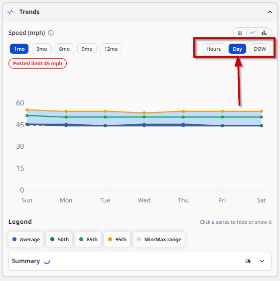
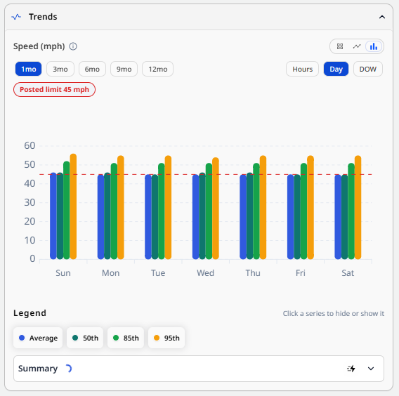
By Day
The trend view by day shows the breakdown for each day of the week. Users can view it as a heatmap, line, or bar graph.
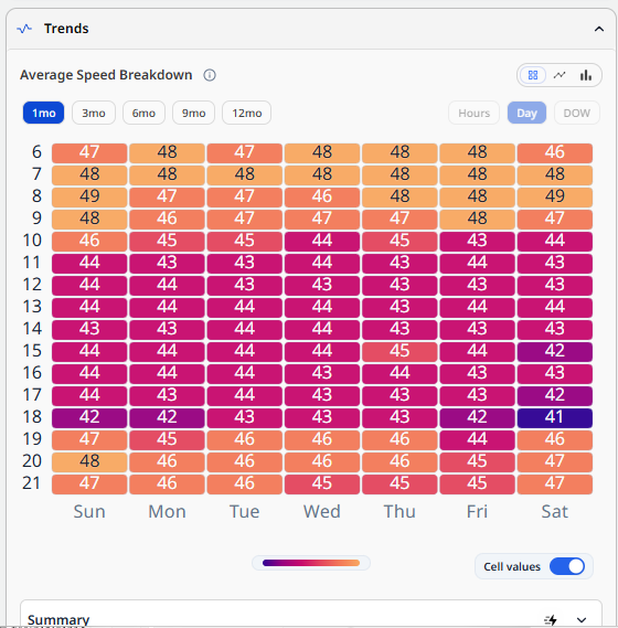
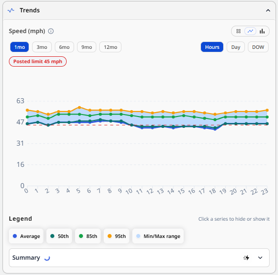
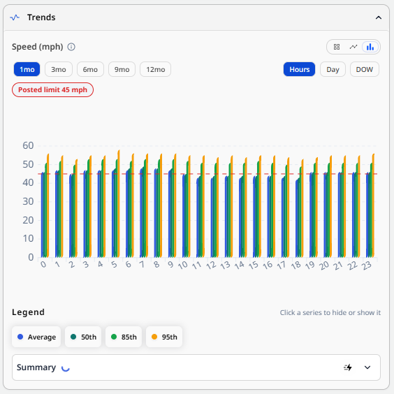
By Hour
The trend view by hour shows the breakdown for each hour of the day. Users can view it as a heatmap, line, or bar graph.
(Pro) - View Summary of Selected Chart/Trailing Period
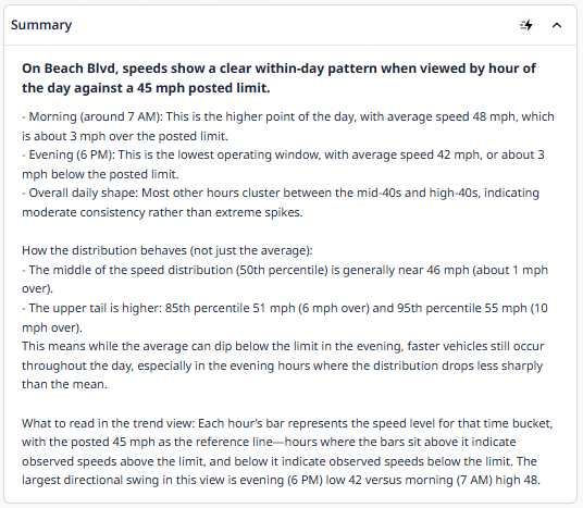
AI customers can view a text summary of the selected chart and trailing period. Instead of reading it and drawing conclusions and writing them out, AI users can request an AI summary that is generated for them for use in a report or other sort of analysis.
(Plus) Review Tasks Nearby
Set Distance Radius
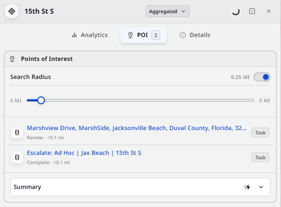
Users can update the radius by which tasks are displayed from their selected road segment using the ‘What’s Nearby’ Panel. Any tasks found within the area defined by the selected segment and radius will be displayed in the list below.
Review Task List
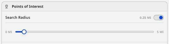
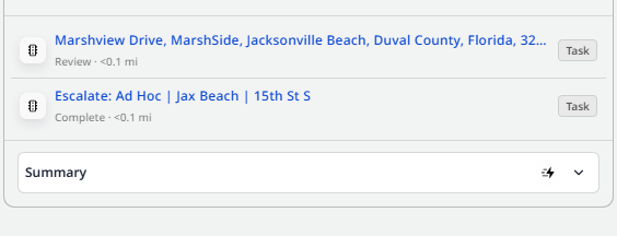
The tasks that are displayed can be seen and reviewed from the list below. When a task is clicked, the user is navigated to the task on the map, and they can then view the task overview and other analytics.
Review Details
Edit Speed Limit
Users can update the posted speed limit for a selected road segment as desired. Depending on various factors (construction, road widening, rezoning, etc.) the data provided may not match the real-time data for the speed limit.
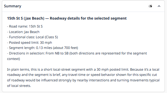
(AI) - View Summary of Details Section
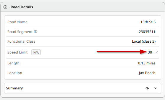
AI customers can view a text summary of the selected road segment’s details. Instead of looking through the details and information provided on the selected area and writing it out as a summary, AI users can request an AI summary that is generated for them for use in a report or other sort of analysis.